Thanksgiving Journey Through Data: Day 2 (Desserts)
Decadent Thanksgiving Desserts Let’s satisfy your sweet tooth! Today, we’re flipping tradition on its head and starting with desserts. Join us as we dive into Thanksgiving’s sweetest trends, exploring the pies, cakes, and other treats that have graced tables across the country. 5-days of Thanksgiving Querri is thrilled to take our readers on a 5-day Thanksgiving journey Through Data...

Decadent Thanksgiving Desserts
Let’s satisfy your sweet tooth! Today, we’re flipping tradition on its head and starting with desserts. Join us as we dive into Thanksgiving’s sweetest trends, exploring the pies, cakes, and other treats that have graced tables across the country.
5-days of Thanksgiving
Querri is thrilled to take our readers on a 5-day Thanksgiving journey Through Data. We'll travel back in time to uncover what was on America’s plate that Thanksgiving night in 2015. Here is a list of what we will cover over the next 5 days:
Day 1: Exploration of the Survey participants —who they are, where they’re from, and how they are distributed throughout the country.
Today, Day 2: Sweet tooth alert! 🍰 Dive into America’s dessert favorites and regional pie debates.
Day 3: Sides steal the show. 🥗 From stuffing to green bean casserole, we’ll uncover the sides that bring families together.
Day 4: The main event: Turkey vs. alternatives—what was trending and who was replacing turkey with other alternatives.
Day 5: Beyond the table—Black Friday shopping trends and the growing popularity of Friendsgiving a decade ago.
The Dataset
This dataset is mainly about the food on the table, but there is also great information about people. 1058 people responded to the 538 Thanksgiving Dinner survey conducted in 2015. They were from all over the country. The list of survey questions can be viewed at the link above.
Pie Charts
About Pies? Yes, Please!
Pie charts may not always get the love they deserve, but let’s face it—can anyone truly resist the charm of a pie chart about pies? Thanks to Querri's intuitive visualizations, even the simplest charts pack a punch. Querri offers a solid foundation of standard visualizations, providing the perfect starting point for diving into any data analysis.
| Querri Prompt: | |
|---|---|
Create a pie chart to visualize the distribution of pie preferences |
 |
Click to zoom.
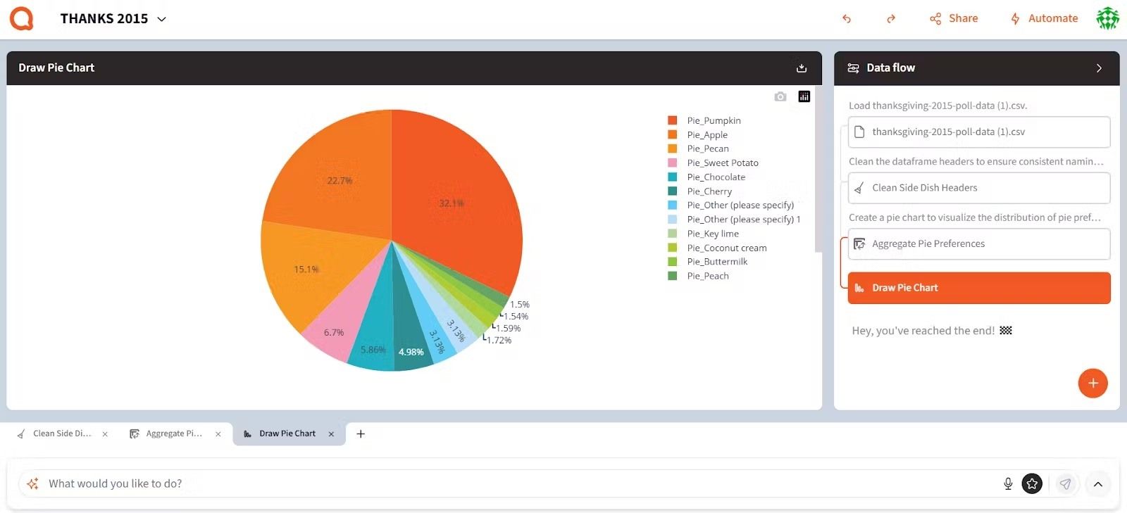
This pie chart offers a delightful visualization of pie preferences, breaking down the most popular types by their percentage of total selections. Pumpkin Pie takes the crown with 32.1% of the votes, followed by Apple Pie at 22.7% and Pecan Pie at 15.1%. Smaller slices include Sweet Potato (6.7%), Chocolate (5.86%), and Cherry (4.98%) pies, while pies like Key Lime, Coconut Cream, and Peach contribute less than 2% each. The chart beautifully captures the wide range of pie preferences, with pumpkin clearly stealing the show.
One of the standout features of Querri is its interactivity—you can click on any legend item on the right to toggle pie slices on or off. Querri also allows us to zoom in or out, pan to specific regions of the graph, or download the entire visualization as a PDF.
Suggestions - Part Deux
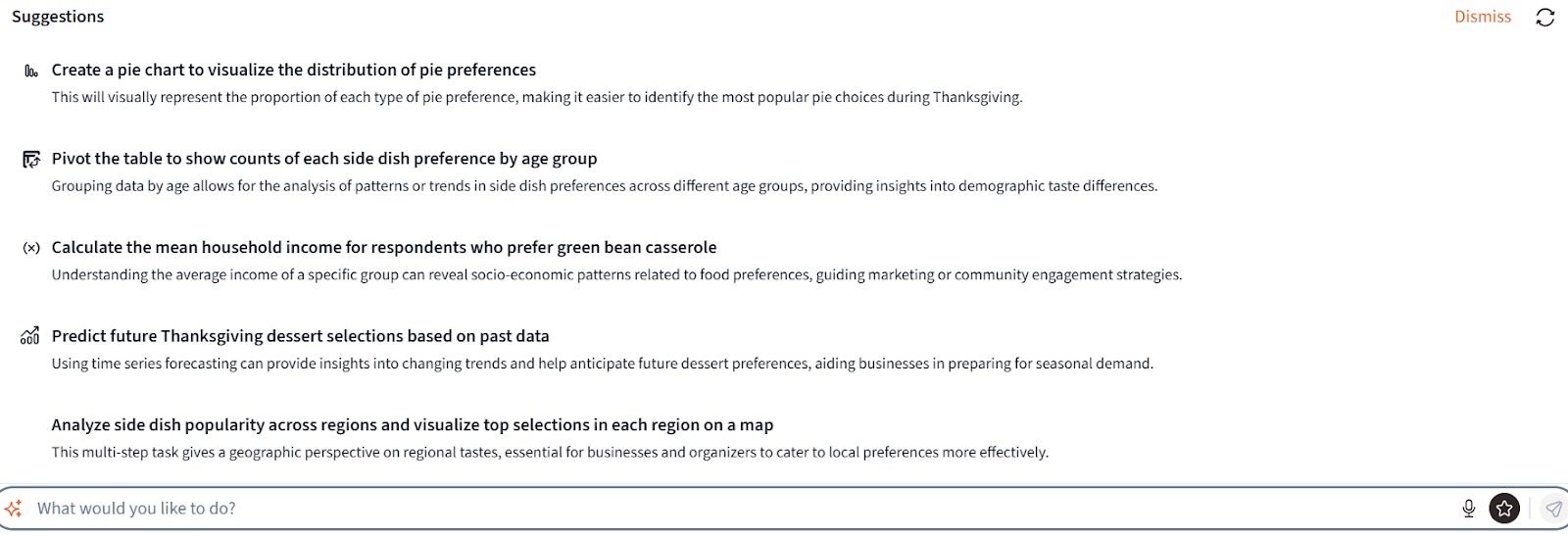
We briefly explored the Suggestions feature in our Day 1. Here it is again! Querri’s suggestion box appears when you click the What do you want to do? prompt. Querri doesn’t just provide smart analysis ideas but also offers helpful phrasing and context for your insights.

We are thankful for stacked bar charts, especially if they look like a dessert 🍰
This chart illustrates the selection counts of various dessert categories across different US regions. The x-axis represents distinct US regions (labeled from 0 to 8), while the y-axis indicates the count of each dessert selection. Each bar is stacked with multiple colors, representing a specific dessert category, such as Apple cobbler, Brownies, Cheesecake, and Ice cream. The chart shows regional dessert preferences, indicating which desserts are most popular in each region. Regions 2 and 6 have the highest total dessert selections, highlighting a broader variety and popularity of desserts compared to other regions. The legend explains color categories.
This is a RETRY with shades of RED (yes, there is a Retry feature in Querri if you wish to enhance or retry your earlier prompt differently). That is just a fun visual no matter what, but the color selection and the colorful legend for pies displayed on the side? Chef Kiss!
Questions That Spark Insight ✨
The art of asking the right questions in data analysis is the cornerstone of uncovering actionable insights—data tells its story only when guided by thoughtful inquiry. As Peter Drucker said, "The most serious mistakes are not being made as a result of wrong answers. The true dangerous thing is asking the wrong question."
Querri enables users to pose thoughtful questions and then responds in the same thoughtful way. Here are a few questions we posed to Querri about the dessert preferences:
Querri Prompt:
Are there any notable differences in dessert choices for families with younger children versus teenagers?Querri Prompt:
Is there a relationship between community type (rural vs. urban) and the variety of desserts served?Querri Prompt:
Analyze the relationship between the number of dessert types served and the age of adults/kids in the household.
Querri Prompt:
Do rural communities tend to prefer more traditional desserts compared to urban communities?
There are dozens of other questions we could have posed to Querri to really dig deep into the dessert data. Here are some others if you wish to try (download the data below):
- $1
- $1
- $1
- $1
The Magic of Cool Visualizations and Storytelling 🎩
Unusual but cool visualizations transform raw data into compelling stories, offering fresh perspectives and engaging audiences in ways traditional charts cannot. As data storyteller Cole Nussbaumer Knaflic said, "Don’t just show your data; tell a story."
And "storytelling with data is about making your data a pivotal point of a narrative that informs, engages, and inspires action."
Mastering storytelling with data is about blending analytical rigor with creative communication to make insights impactful. It requires understanding your audience, crafting a clear narrative, and choosing visuals that enhance, not distract, from the story. By honing these skills, you can turn data into a powerful tool for driving decisions and sparking engagement.
Quick Tips:
Start with the "Why": Understand the purpose of your analysis and what decisions or actions it should inspire.
Know Your Audience: Tailor your story to their level of expertise, interests, and goals.
Focus on Simplicity: Highlight key insights and avoid cluttering visuals with unnecessary data.
Choose the Right Visuals: Use visualizations that best represent your data’s story—bar charts for comparisons, heatmaps for patterns, etc.
Iterate and Refine: Test your story with peers, gather feedback, and continuously improve your narrative and visuals.
Querri’s ability to draw these cool visualizations left us speechless!
Querri Prompt:
Create uncommon, unique visualizations- Spider diagram showing dessert preferences across different regions
- Sankey diagram of traditional vs. non-traditional desserts across different community types
- Box Plot diagram of dessert preferences according to age
- Rose Diagram of dessert preferences across different community types
Calling It A Day On Day 2
With our exploration of America’s pie and dessert preferences at Thanksgiving tables, we wrap up our Day 2. We saw just how powerful Querri can be in uncovering meaningful insights from data, even when it comes to something as deliciously complex as dessert preferences.
Here’s what we accomplished today:
Delved into dessert trends from a decade ago, uncovering sweet favorites.
Created a variety of visualizations, from classic pie and bar charts to unique, eye-catching visualizations as an aid in storytelling.
Asked Querri thoughtful questions and discovered that curiosity fuels its brilliance.
Querri clearly thrives on curiosity—and so do we! Whether planning a holiday menu, fine-tuning a marketing strategy, or digging into customer behavior, Querri equips you with the tools to move from data to decisions seamlessly.
And the best part? We're only halfway through—stay tuned as we explore even more ways Querri can transform your approach to data analysis in the days ahead!
In the meantime, feel free to explore the Day 2 (includes Day 1 data) dataset in Querri! Download it below and let your curiosity guide you—take cues from above or ask any questions that spark your interest.
Sign up for the Querri trial and download the Day 2 data below. Note: You may not see a file download confirmation even when the file is successfully downloaded. Please check your downloads folder for the TG-Day-2-Data.csv filename.
We will see you tomorrow, Day 3, with Sides at the Thanksgiving table.