Thanksgiving Journey Through Data: Day 4 (The Main Dish)
No Thanksgiving table is complete without its star—the main dish! While sides may steal some of the spotlight, it’s the centerpiece turkey, succulent ham, or even a hearty plant-based roast that truly sets the tone for the feast. Today, we’re diving into Thanksgiving main dish trends, uncovering regional variations, timeless classics, and surprising shifts in preferences.

No Thanksgiving table is complete without its star—the main dish! While sides may steal some of the spotlight, it’s the centerpiece turkey, succulent ham, or even a hearty plant-based roast that truly sets the tone for the feast. Today, we’re diving into Thanksgiving main dish trends, uncovering regional variations, timeless classics, and surprising shifts in preferences. Whether you're team traditional or love to experiment, there's a story behind every main course, and Querri is here to dish it out. Let’s serve up the data!
5-days of Thanksgiving
Querri is thrilled to take our readers on a 5-day Thanksgiving journey Through Data. We'll travel back in time to uncover what was on America’s plate that Thanksgiving night in 2015. Here is a list of what we will cover over the next 5 days:
Day 1: Exploration of the Survey participants —who they are, where they’re from, and how they are distributed throughout the country.
Day 2: Sweet tooth alert! 🍰 Dive into America’s dessert favorites and regional pie debates.
Day 3: Sides steal the show. 🥗 From stuffing to green bean casserole, we’ll uncover the sides that bring families together.
Day 4: The main event: Turkey vs. alternatives—what was trending and who was replacing turkey with other alternatives.
Day 5: Beyond the table—Black Friday shopping trends and the growing popularity of Friendsgiving a decade ago.
The Dataset
This dataset is mainly about the food on the table, but there is also great information about people. 1058 people responded to the 538 Thanksgiving Dinner survey conducted in 2015. They were from all over the country. The list of survey questions can be viewed at the link above.
Turkey Takes the Crown—No Surprises Here!
By now, cleaning and exploring data has become second nature to us, and with this Thanksgiving dataset, we dove right in. Starting with a pie chart of the main dishes, the results were no shocker—Turkey dominated as the clear winner, just as we expected. But what about the other contenders? By clicking to exclude Turkey, we quickly shifted our focus to the alternative main dishes. This effortless adjustment revealed a range of creative options, from classic favorites like Ham and Pork to more unconventional choices like Turducken (Duck stuffed inside a Chicken stuffed inside a Turkey). It’s a simple yet powerful way to dig deeper into the stories your data holds!
Unlocking Patterns: The Power of Statistical Modeling
Statistical modeling is like having a magnifying glass for your data. It allows you to uncover hidden patterns, relationships, and trends that might otherwise remain buried in the noise. By applying mathematical techniques to raw numbers, statistical models can identify correlations, test hypotheses, and even predict future outcomes. For example, regression models can show how sales are influenced by marketing spend, while clustering algorithms can group customers based on purchasing behavior. These insights enable decision-makers to act with precision and confidence, turning data into a powerful ally rather than an overwhelming challenge.
The real beauty of statistical modeling lies in its ability to simplify complexity. In a world awash with information, models act as bridges between raw data and actionable intelligence. They strip away distractions, focus on what truly matters, and provide a framework for understanding. However, the process is as much an art as it is a science. Choosing the right model, interpreting results accurately, and accounting for potential biases requires a thoughtful approach. Done right, statistical modeling transforms businesses, streamlines operations, and fosters innovation—one dataset at a time.
Advanced Analysis, Made Simple with Querri
Querri packs some serious analytical firepower, but the best part? You don’t need advanced technical skills to use it. By democratizing data access and analysis, Querri makes powerful tools available to beginners and novice users alike—as long as you understand your data, Querri will guide the rest.
For instance, take the prompt, “What statistical analysis can be performed with this data?” Querri instantly generated a comprehensive list of statistical techniques applicable to the dataset. From there, all the user has to do is copy and paste their desired prompt, and voilà—analysis made effortless.
Here are some online resources to get started on the basics of Statistical Modeling:
- $1
- $1
- $1
- $1
- $1
From Data Chaos to Clarity
Data professionals often face a daunting challenge: uncovering meaningful insights hidden in their data. The process can feel like panning for gold—tedious, messy, and without guarantee of striking it rich. You know the value is there, but getting to it means wrestling with disorganized data, analyzing endlessly, and hoping for a breakthrough. Querri changes the game. It empowers users to explore their data without fear or frustration, acting as a helpful guide for experimenting and uncovering insights.
Whether you're crystal clear on your goals or still navigating uncertainty, Querri gives you the tools and freedom to test ideas, refine your thought process, and extract those hidden gems effortlessly. It's your partner in turning data chaos into actionable clarity.
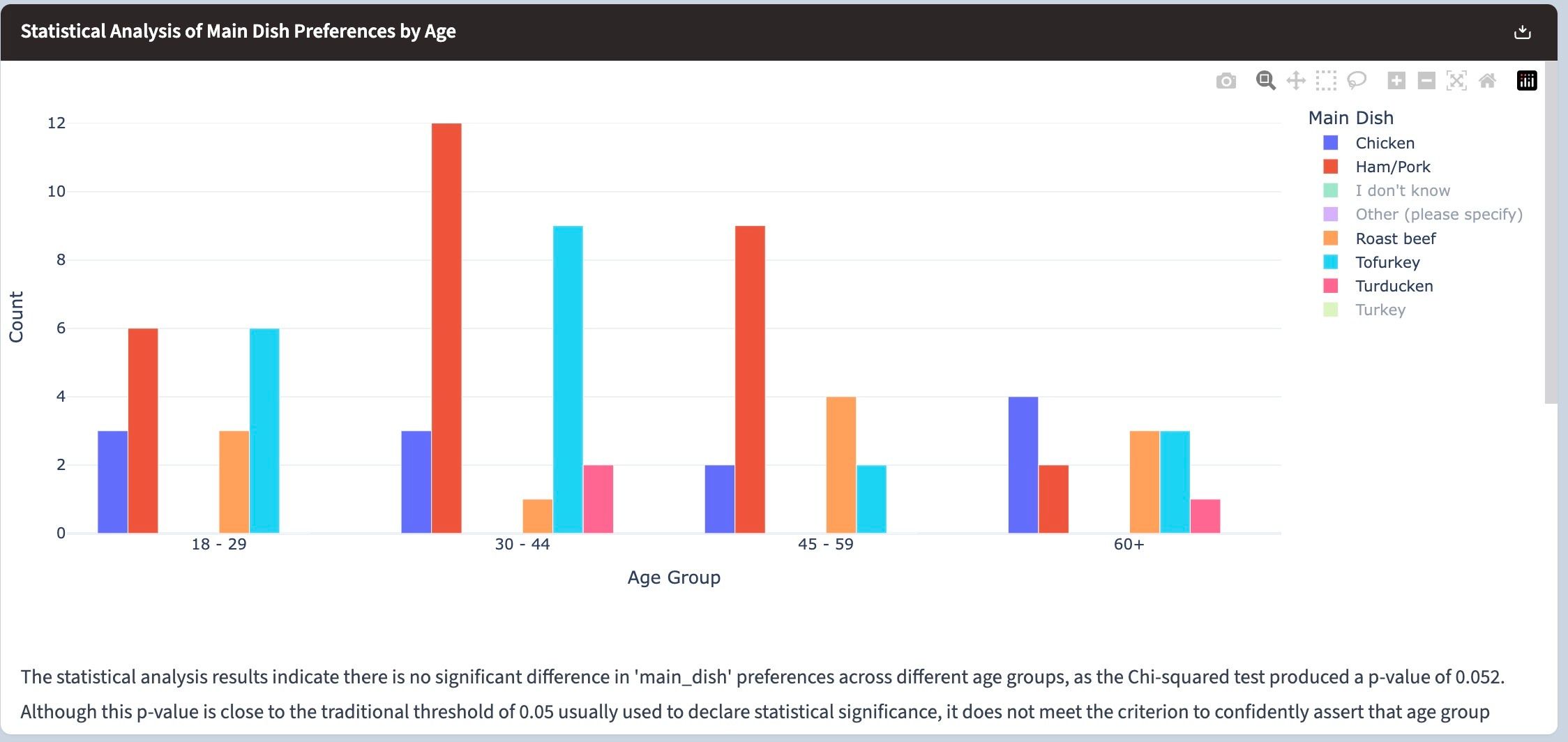
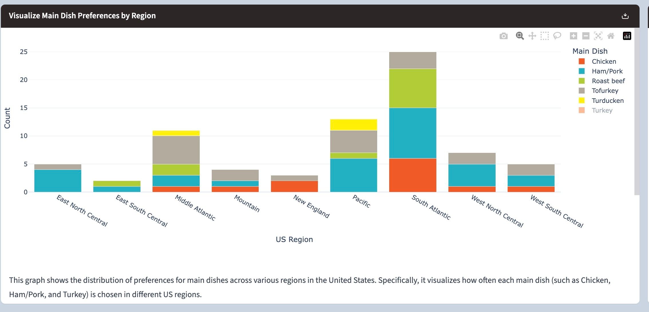
Below, we explore the main dish preferences by age and region. Excluding Turkey surfaced other non-traditional choices, with Ham/Pork right behind Turkey in all age groups, except for the 60+ group, where chicken seems to be the primary choice for the main dish, followed by roast beef and tofurkey right behind.

Region-wise, again, there are no surprises, except for a fascinating insight that respondents in the Pacific region are much more adventurous than the rest of the country, with their choice of turducken shining bright!

Querri Learns and Delivers—Your Way
When you first meet Querri, you might feel like you’re not quite on the same wavelength. Maybe it’s doing a little too much or not exactly what you envisioned. But here’s the beauty: Querri is incredibly coachable. Show it how you like your data presented just once, and it’ll remember, learning to serve it your way every time after.
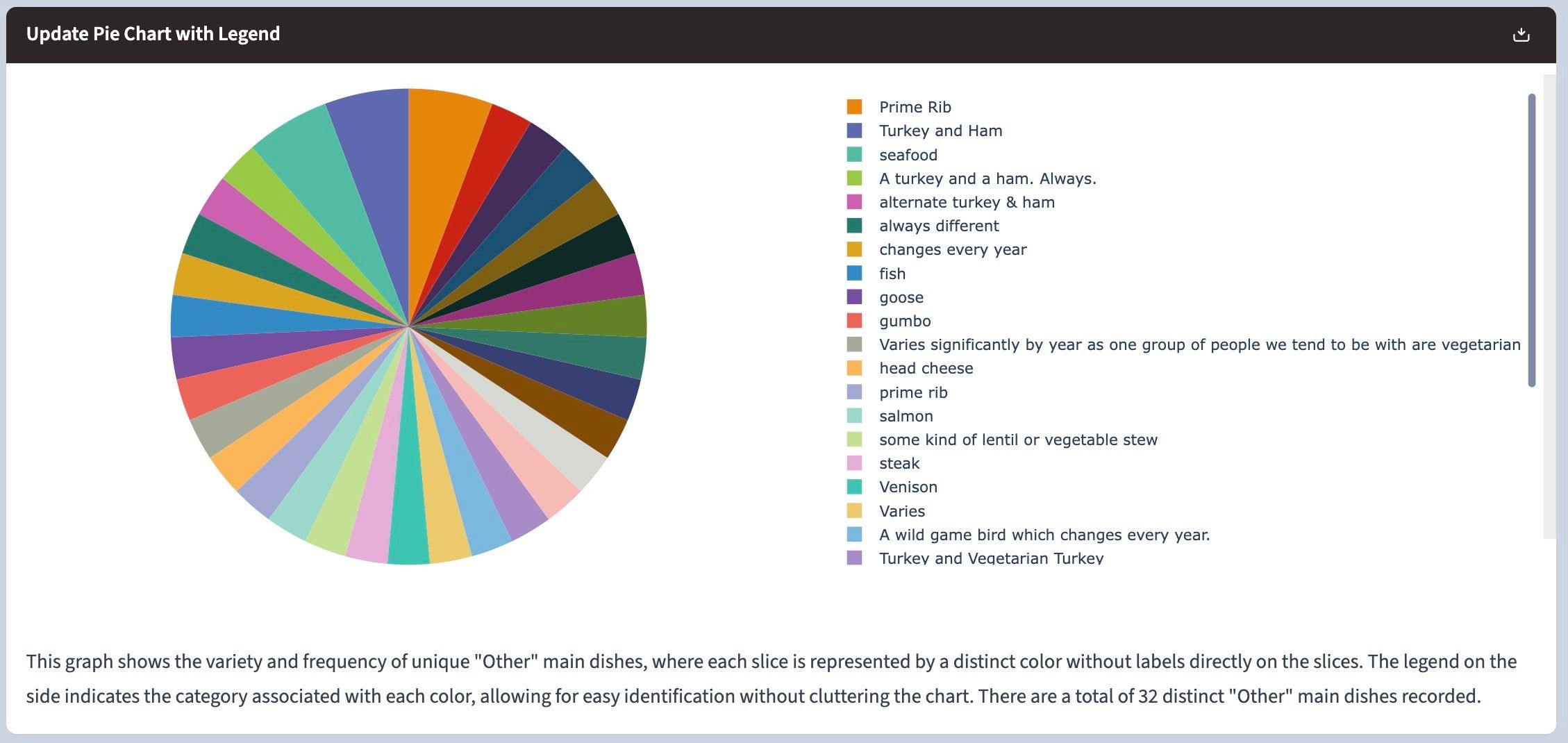
Take this example: we analyzed alternative Thanksgiving main dishes and found some fun responses—from prime rib and goose to lentil stew and head cheese. Querri pulled together a visualization, but the cluttered labels weren’t exactly pleasing. “Querri, where’s your eye for design?” we joked. But with one simple prompt, we got Querri to adjust, delivering a colorful, label-free pie chart that perfectly highlighted the data.
The result? A clean, aesthetic visualization that brought the insights to life. With Querri, you’re always in control—ready to tweak, refine, and experiment as you explore your data.

Easter Eggs and Querri’s Playful Side
What’s a great Thanksgiving dinner without an Easter egg? Sure, Easter’s months away, but why not sprinkle some fun into your data work? That’s one of the reasons you’ll fall in love with Querri—it doesn’t just simplify data analysis; it makes the process downright enjoyable. Goodbye, boring spreadsheets, hello creativity!
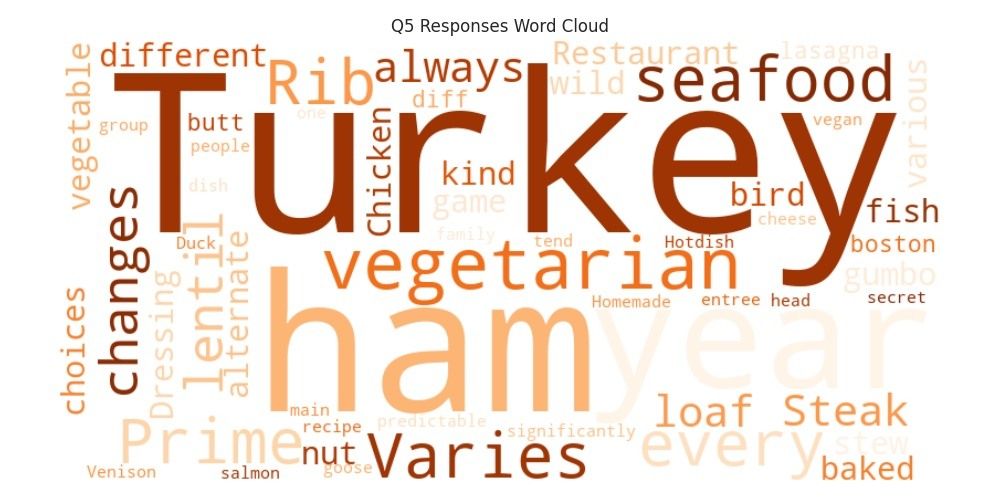
For example, while Querri can churn out dazzling visualizations, it also handles fun challenges effortlessly. With just a simple prompt—“Create a word cloud from the main_dish column”—it delivered a playful, engaging word cloud that highlighted Thanksgiving trends. And there it was, a little surprise: “Restaurant takeout” standing out among the homemade favorites. Querri proves that working with data doesn’t have to be dry. It can be insightful, delightful, and even a little whimsical.

Calling It A Day On Day 4
Just as Thanksgiving dinners revolve around the classic Turkey while celebrating diverse alternatives, Querri strikes a balance between tradition and creativity in data analysis. With its intuitive tools and playful approach, Querri turns data analysis into a delightful experience. It allows users to dig deeper, experiment, and uncover hidden stories in their data.
Like Thanksgiving, where the joy is as much in the shared experience as the dishes, Querri ensures that working with data is as enjoyable as the insights it uncovers.
Here’s what we accomplished today:
Explored the trend on the main dish and found no surprises either region-wise, by age, or in general.
Witnessed Querri's powerful statistical analysis capability without a need for a Ph.D. in Statistics.
Witnessed Querri's playful side with WordCloud, which still delivered meaningful insights by creatively showcasing the most popular main dishes and a little easter egg.
In the meantime, feel free to explore this dataset in Querri! Download it below and let your curiosity guide you—take cues from above or ask any questions that spark your interest. Sign up for the Querri trial and download the Day 4 data below. We will see you tomorrow, the final day, with Black Friday Shopping Trends.