Meet Querri Wrapped: February's Updates Turn Your Analysis Into a Story Worth Sharing
This month, we're introducing Querri Wrapped—a cinematic, Spotify-Wrapped-inspired way to turn any analysis into an animated story that lands—alongside a fully production-grade Dashboard Builder. February is about making your data impossible to ignore.

Meet Querri Wrapped: February's Updates Turn Your Analysis Into a Story Worth Sharing
I've been sitting on this one for a while, and I'm genuinely excited to finally show it to you.
Every month, we ship features that make Querri smarter or faster. But occasionally we ship something that changes the feel of the product—something that makes you look at your analysis differently. Querri Wrapped is that kind of release. And paired with a completely rebuilt, production-grade Dashboard Builder, this is one of the most substantial months we've ever had.
Let me show you what we built.
Querri Wrapped: Your Data Has Never Looked Like This
If you've seen a Spotify Wrapped, you know the moment I'm talking about: your year of listening compressed into something that actually moves you. Big numbers, bold design, a sense that your data has a story worth telling. We asked ourselves—why can't a business analysis feel like that?
Querri Wrapped is exactly what it sounds like. Once you've completed an analysis in Querri, you can generate a fully animated, AI-powered data analytics presentation built entirely from your results. No design skills needed. No export-to-PowerPoint-and-spend-an-hour-making-it-look-right. You hit Wrap, and your analysis becomes a story.
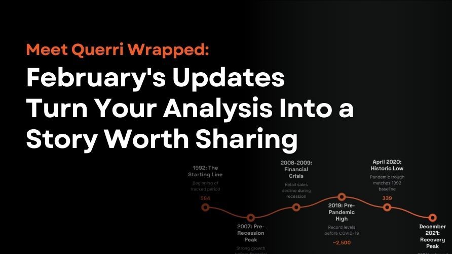
The experience is built around a sleek dark-mode canvas. A title card sets the scene with your project name, date range, and a one-line context summary—then invites the audience to "Swipe to explore." From there, your insights reveal themselves slide by slide: headline numbers animate in with dramatic weight, charts draw themselves in teal against the dark background, key moments surface as bold orange callouts, and narrative text explains the significance of what you're seeing. It's not a deck. It's closer to a documentary about your data.
Each Wrapped presentation flows through a narrative arc that Querri's agentic AI builds from your analysis automatically: a hook with the biggest headline number, a full journey through your data over time, inflection points and key moments, seasonal patterns, disruptions and recoveries, and a closing attribution slide. The dot navigation at the bottom lets you move through at your own pace, or you can hit Present to run the full animated experience in front of a room.
When you're ready to share, you have two options built right into the interface:
- Download as PDF — a polished, print-ready version of every slide, ready to attach to an email or drop into a report.
- Export as editable PowerPoint — hand the whole thing off to your team to customize, extend, or fold into an existing deck. The design holds up in PowerPoint without losing its character.
There's also a Share button that generates a link, so collaborators can swipe through the Wrapped experience directly in their browser—no login required.
I want to be direct about what this unlocks. The typical path from "great analysis" to "something I can actually share with leadership" involves a lot of in-between work—screenshots, reformatting, slide building. Querri Wrapped eliminates that entirely. You get a finished, beautiful story in seconds. That's what I've always wanted this product to do.
The Wrapped demo above was built from real data — "Retail Sales: Hobby, Toy, and Game Stores" from the U.S. Census Bureau via FRED®. Explore it yourself, or use it as a starting point for your own Querri Wrapped:
🔍 Preview the dataset. | ⬇️ Download the CSV. | 🚀 Analyze it with Querri
Dashboard Builder: From Beta to Best-in-Class
The Dashboard Builder is now a complete, production-grade tool for creating interactive dashboards directly from your analysis results. With 200+ commits in this release cycle, the builder has been transformed from an early preview into a powerful layout engine—and the difference is substantial. Here's what it can do.
A full widget library. Dashboards can now be built from a rich set of components: interactive Plotly-powered charts with zoom, pan, hover tooltips, and download options; virtualized data tables with pagination, resizable columns, sticky row numbers, and sorting for large datasets; a full WYSIWYG rich text editor for narrative and commentary directly in the layout; static images and SVG chart exports; Excel widgets for embedding read-only spreadsheet data; spacers; and section headers to organize your layout into labeled chapters. Every widget pulls live data from your project steps, so your dashboard is always connected to the underlying analysis.
Drag-and-drop layout that actually works. You drag widgets from the sidebar, drop them onto the canvas with visual drop zone indicators, resize them horizontally by dragging column edges, resize rows vertically with snap-to-content handles, and reorder widgets across rows. Column span controls let you design for desktop, tablet, and mobile viewports without rebuilding from scratch.
A properties panel for every detail. Select any widget and a floating properties panel opens with controls for title, width, height, padding, gap, card border style, canvas background, and grid customization. You can set a dashboard-wide max-width or go full-bleed. It's the level of control that makes the difference between a dashboard that looks like a draft and one you'd send to a client.
Auto-Save and Responsive Preview
Your work is always protected. Changes are persisted automatically as you edit. Undo and redo use debounced history snapshots so you can step back through your editing session cleanly. If your browser closes unexpectedly, your last state is restored when you come back.
We also added a responsive preview mode directly in the builder header. Switch between Desktop, Tablet, and Mobile while you're building—you're never guessing how your layout will look on someone else's screen.
Sharing, Password Protection, and Widget Embedding
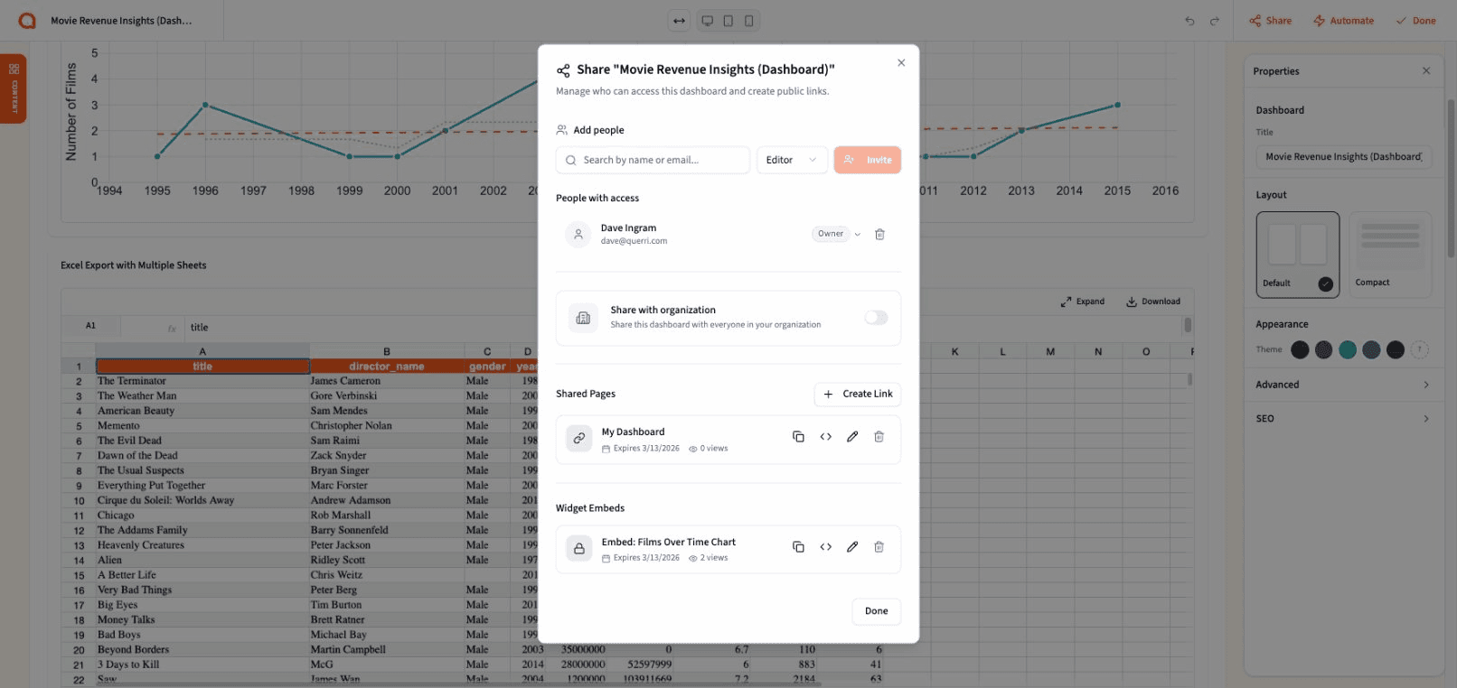
We rebuilt how dashboards get shared, and the result covers three distinct use cases.
Public share links generate a read-only URL that anyone can view without a Querri login—perfect for external reporting or client-facing dashboards. Password protection adds an optional access layer at either the dashboard or individual widget level. Widget embedding lets you take any individual chart, table, or component and get a standalone embed code to drop into your internal tools, company intranet, or external portal. Password protection carries through to embedded views, and the embed respects the same read-only access controls as the full dashboard.
Shared dashboards now also include full SEO and Open Graph support—meta tags, a 1200×630 social preview image, and Twitter Card metadata—so a dashboard link pasted into Slack or email renders with a real preview instead of a bare URL.
What This Means for You
This month's releases share a common thread: closing the gap between doing the analysis and having it actually land with the people who need it.
Querri has always been strong at helping you get to insight. The Wrapped feature and the new Dashboard Builder are about what happens next—making sure those insights travel well, look great, and reach the right audience in a format that holds their attention. Whether that's a Wrapped story that walks leadership through 33 years of retail trends, a live dashboard embedded directly in your team's tools, or a single chart shared with a link, the output is now something you're proud to put your name on.
Ready to see what your analysis looks like Wrapped? Log in to Querri and give it a try—or check out our February release notes for the full details.
Tags