How to Analyze Ticket Volume Drivers to Reduce Repeat Contacts
Identify which ticket categories are generating the most repeat contacts, quantify the deflection opportunity, and come to your next planning meeting with numbers instead of instincts.
Open QuerriWhat you'll need
Querri (Free trial) to connect your ticket data, run analysis, and generate the deflection opportunity table
Support ticket export — CSV from Zendesk, Intercom, Freshdesk, or Salesforce Service Cloud with subject/reason tag, category, product area, created date, and resolution type
Optional: KB article views — a separate export with article title, article ID, and view count (required for Step 5)
Need help?
If you have any questions, you can request a demo or email our team.
Before we begin
The most expensive ticket is the second one on the same issue. Repeat contacts drain headcount, suppress CSAT, and signal that something upstream (a product friction point, a knowledge base gap, a broken process) isn't getting fixed.
The problem is rarely motivation. Most support leaders want to address root causes. The problem is evidence: knowing which categories are generating the most repeat volume, how that compares to what's trending, and where self-service should exist but doesn't. This playbook shows you how to get that evidence: starting from a raw ticket export, ending with a bar chart and a prioritized deflection opportunity table your team can act on.
How it works:
- • Connect a CSV export from your helpdesk (Zendesk, Intercom, Freshdesk, Salesforce Service Cloud) or use a live Data Connection
- • Run five prompts to go from raw ticket data to a category volume breakdown, trend direction, and deflection opportunity table
- • If your tags are inconsistent or heavily weighted toward "Other," use the Categorize tool to find real patterns in the ticket text itself, no clean taxonomy required to start
- • Optionally join KB article view data to identify self-serve gaps: categories where customers contact support but can't find answers in your help center
- • Export to Excel and bring a prioritized table to your next roadmap or content planning meeting
Follow the steps
Upload your ticket data
Start by uploading a CSV export from your helpdesk: Zendesk, Intercom, Freshdesk, or Salesforce Service Cloud all work. Querri profiles the file automatically and prepares it for analysis. No reformatting required.
If your helpdesk supports a direct data connection, check Querri's integrations page; connected sources stay current without manual exports.
Required columns: subject/reason tag, category, product area, created date, and resolution type. Customer ID or email is optional but needed for the repeat contact analysis in the Going Deeper section below.
Group and count tickets by category and tag over a rolling 90-day window
With your data connected, run this prompt to get your volume baseline: which category-tag combinations are generating the most contacts over the last quarter.
"Group tickets by category and subject/reason tag over a rolling 90-day window. Show total ticket count for each combination, sorted by volume descending."
Why 90 days? It's long enough to smooth out weekly variance, short enough to reflect current product and process reality. This is your baseline before anything else.
Identify the top 10 categories by volume and trend direction
Volume alone doesn't tell you where to focus. Adding trend direction shows which categories are growing versus stabilizing, which changes how you prioritize.
"From the ticket data, identify the top 10 categories by total ticket volume over the past 90 days. For each category, calculate the volume in the most recent 30 days compared to the 30 days before that, and label the trend as Increasing, Stable, or Decreasing."
A stable high-volume category is a candidate for deflection investment. One that jumped 40% last month may need immediate investigation. The trend label is how you set priorities.
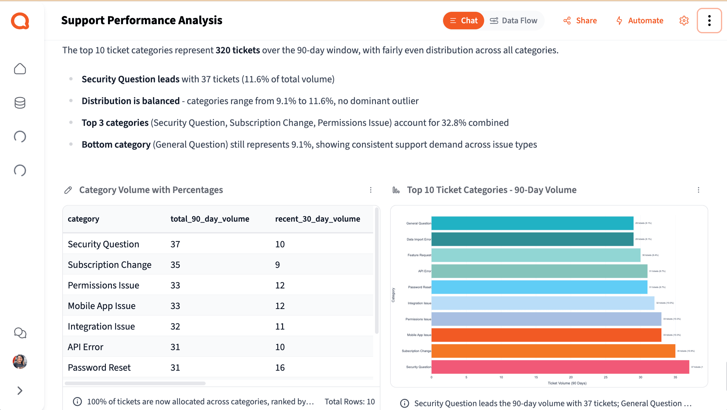
Calculate the % of total volume each category represents
This is your primary output visual: a bar chart that answers the question every deflection conversation starts with: "What are we actually solving for, and how big is each piece?"
"For the top 10 ticket categories, calculate what percentage of total ticket volume each one represents over the 90-day window. Display as a bar chart sorted by volume, with the percentage labeled on each bar."
Then export the deflection opportunity table: Ask Querri to format the top 10 categories with volume, trend direction, estimated deflection potential (High / Medium / Low), and recommended action type (KB Article, In-App Guidance, Product Fix, or Process Change), and export to Excel. Bring it to your next roadmap or content planning meeting.
Sanity check: Note what percentage of tickets are tagged "Other" or "General." If it's 30%+, flag it in your output: the chart is missing signal. See the Going Deeper section below for how to recover it.
Join KB article view data to surface high-volume categories with low self-serve usage
This step surfaces the clearest deflection opportunities: categories customers are contacting support about, but not finding answers to in your help center.
"Connect the knowledge base article view data. Join it to the top ticket categories from the support ticket analysis. For each high-volume category, identify whether a corresponding KB article exists and how many times it was viewed in the same 90-day period. Flag categories where ticket volume is high but KB article views are low or where no article exists."
A high-volume category with zero or near-zero KB views is a strong signal that the content either doesn't exist, isn't findable, or isn't solving the problem. That's where your content investment should go first.
Turn your analysis into a presentation. Once you're done, ask Querri to wrap it up as a slide deck; it'll pull your charts, category breakdown, and deflection opportunity table into a structured presentation you can share directly with your team or leadership.
Going deeper
Add structure to individual tickets
Going deeper
Add structure to individual tickets
The five steps above give you aggregate patterns: which categories, how much volume, what trends. When you need to go row by row and understand what's happening at the individual ticket level, the Researcher and Categorize tools give you three additional options.
Classify tickets by self-service potential
The aggregate deflection potential in Step 4 is an estimate. The Researcher applies that classification row by row against the actual ticket content, giving you a more defensible number for how much volume is truly deflectable.
"Add a 'Self-Service Potential' column to each ticket, classifying it as: Fully Self-Servable, Partially Self-Servable, or Requires Agent."
Flag repeat contacts at the ticket level
Once flagged, you can filter to repeat contacts only and run any of the above prompts on that subset. Some categories have low total volume but very high repeat rates, meaning the issue is systematically not getting resolved.
"Add a 'Repeat Contact' column flagging any ticket from a customer who submitted a ticket in the same category within the previous 7 days. Label flagged tickets as Yes and include the original ticket ID."
Recover signal from messy or catch-all tags
If your sanity check revealed significant "Other" or "General" volume, this is the recovery path. Categorize reads raw ticket text and finds natural groupings, without requiring you to define the buckets first.
"What are the main themes in the ticket descriptions for tickets currently tagged 'Other' or 'General'?"
Tips for a better analysis
Check tag hygiene before you start
Before drawing conclusions from your category breakdown, check what percentage of tickets sit in "Other" or a catch-all. If it's 30% or more, note this explicitly in your output and use the Categorize tool to recover the missing signal, but don't wait for perfect taxonomy to begin.
Use the 90-day window as your default baseline
The 90-day window smooths out weekly variance while still reflecting current reality. Shorter windows are noisier; longer ones can mask recent product or process changes that are actively driving volume up or down.
Bring the table, not just the chart
The bar chart answers "what are we solving for." The deflection opportunity table answers "what do we do about it." Both are needed for a productive planning meeting. Don't share one without the other.
Product issues are great outcomes, not failures
When the analysis points to a product issue rather than a content gap, that's the best possible result: it gives your team quantified evidence to bring to engineering, not just anecdotes. The export is designed for exactly this conversation.
Tags are a starting point, not a prerequisite
You don't need a clean taxonomy to start. Even when tags are inconsistent, Querri can work from the raw ticket text to find real patterns. Use the Categorize tool on any catch-all buckets to surface what's actually inside them, then address the tagging practice going forward.
Run monthly; do a full review quarterly
Once you've run this the first time, follow-up runs take under 10 minutes. Monthly you're checking whether trends have shifted. Quarterly you're doing a full deflection opportunity review to assess whether your investments are showing up in the numbers.
Frequently asked questions
How do I reduce repeat contacts in customer support?
How do I identify the root causes of high support ticket volume?
What is deflection rate in customer support, and how do I improve it?
How do I build a business case for knowledge base or self-service investment using ticket data?
How do I analyze support ticket trends to prioritize where to focus?
Other popular resources
Examples
Browse all use cases
Explore how other teams use Querri for data analysis.
Blog
Analyzing NPS responses at scale
From survey chaos to clear themes: a practical walkthrough.
Demo
Request a walkthrough
See Querri in action with your own data.
Blog
Making sense of unstructured text
How to actually analyze open-ended ticket and survey data.