From Survey Chaos to Clear Themes: Analyzing NPS Responses at Scale
You have hundreds — maybe thousands — of NPS responses sitting in a spreadsheet. Here's how to stop ignoring them and start using them to make better decisions.

You send the NPS survey. The scores come back. Someone does the math, puts a number in a slide, and the meeting moves on.
But buried in the "tell us more" field — the one thousands of customers actually filled out — is the part that matters most. The why behind the number. The frustration driving detractors. The thing promoters keep bringing up unprompted. The product gap hiding in plain sight.
Most teams never get to it. Not because they don't care, but because there's no practical way to read 3,000 individual responses and come out the other side knowing something useful.
This post is about changing that. Not by reading everything — but by asking the right questions of your data and letting the tools do the heavy lifting.
The Real Problem with NPS Data
The score is easy. You calculate it, track it, report it. But the open-ended responses are where the actual signal lives — and they're notoriously hard to work with.
Volume makes reading impractical. Even a mid-sized survey can produce thousands of responses. At two minutes per response, you're looking at days of work before you've learned a single thing.
The same issue gets said a dozen different ways. "Slow response time," "it takes forever to hear back," and "support was unresponsive" are all the same complaint — but they'll never appear as such in a spreadsheet.
You don't know what you don't know. Before you can categorize feedback, you need to know what categories exist. That means manually skimming data first — a frustrating loop that most teams just skip.
Recency bias shapes what you remember. Even teams that do read responses tend to form impressions based on whatever's freshest, not what's most common.
The result: rich, honest customer feedback sits untouched in a spreadsheet, while decisions get made on gut feel instead.
Two Ways to Get Answers
Querri's Researcher and Categorize tools are both built for exactly this kind of text data — but they approach it differently, and knowing when to use each one makes all the difference.
The Researcher adds structure to your data row by row. You tell it what columns you want — sentiment, theme, urgency, complaint category — and it reads each response individually and fills them in. Use it when you know what labels or categories you're working with. You end up with a dataset you can filter, count, and chart.
The Categorize tool discovers the structure in your data when you don't know what to look for. It finds the natural groupings across all your responses — without you defining the categories upfront — and assigns every row to one. Use it when you're exploring for the first time and need the data to show you what's there.
Querri's analytical layer sits across both. You can also simply ask Querri questions in plain language — "What are customers complaining about most?" "What do promoters love?" — and get a synthesized, written answer without needing to set up any columns first.
Use one, use both, or run them in sequence. The prompts below will show you exactly how.
Before diving into prompts, you can test this yourself with a sample dataset. We've put together a sample NPS feedback file with 4,200 rows of rich customer responses — ready to connect in Querri.
Download the sample NPS dataset →Connect it in Querri, then try any of the prompts below.
Ask Querri to Analyze Your Feedback
These prompts let you ask Querri direct analytical questions about your NPS data. You get a synthesized, plain-language answer — summaries, patterns, ranked findings — without reading a single response yourself. Just connect your data and ask.
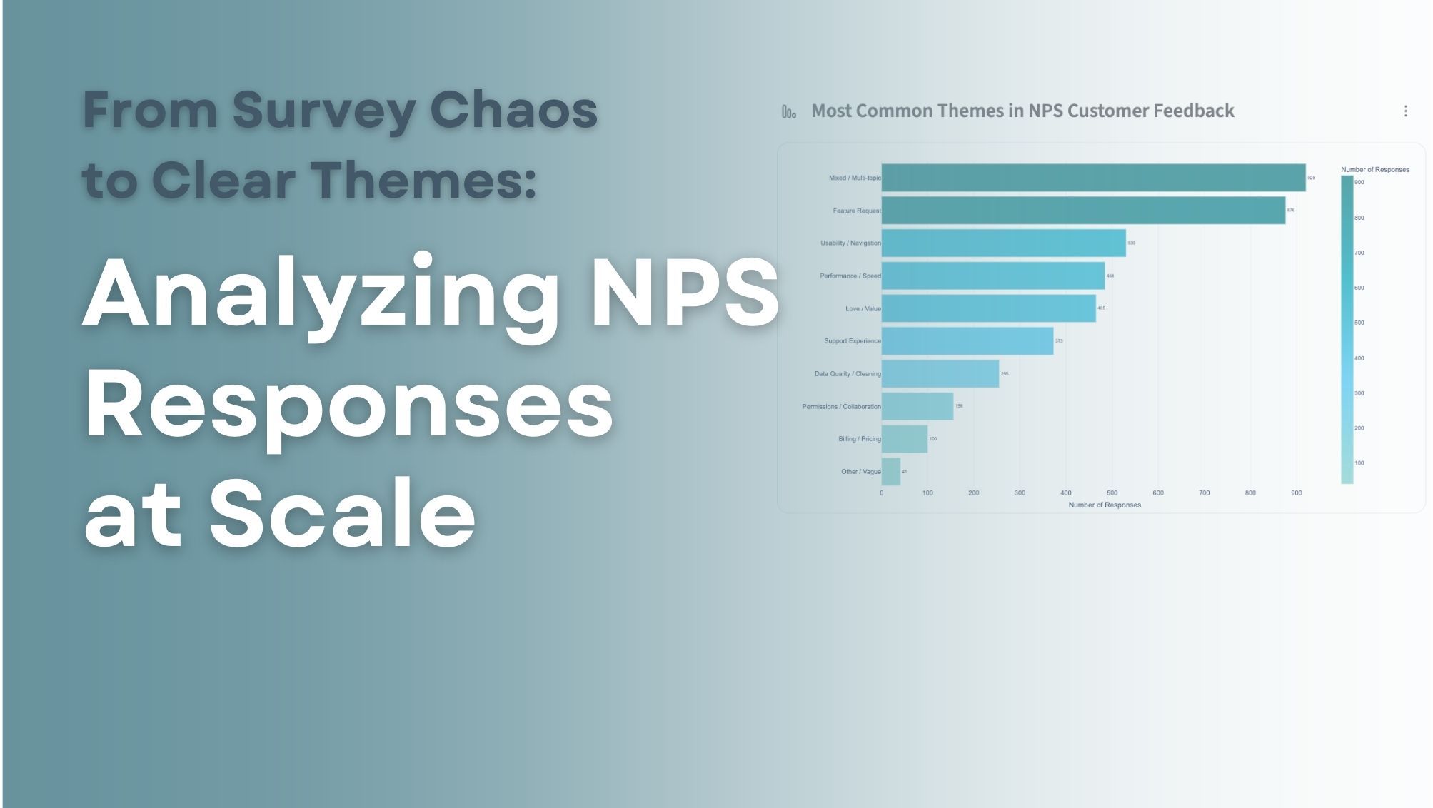
Understand what customers are saying overall
Analyze the
commentcolumn and identify the most common themes customers mention in this NPS survey. Provide a summary of the key themes and include example quotes from customers.
The best starting point for any NPS analysis. Instead of reading everything yourself, you get a synthesized view of what customers are actually talking about — with real quotes to back it up.
Find out what's frustrating people
Review the NPS comments and summarize the most common complaints mentioned by customers. Rank them by frequency and include representative examples.
Ranked complaints, pulled from thousands of rows. This is the kind of output that typically takes days to produce manually.
Understand what your promoters love
Analyze comments from customers with NPS scores of 9 or 10 and summarize what they say they value most about the product.
The flip side of complaint analysis — and just as important. Knowing what's working helps you protect it, replicate it, and lead with it in your messaging.
Dig into why scores are low
Analyze comments from customers with NPS scores of 6 or lower. Identify the main reasons customers give low scores and summarize the patterns you see.
This is the core of CX reporting. Instead of reviewing every detractor response individually, you get a pattern summary — organized, ranked, and ready to share.
Spot problems before they escalate
Look through all NPS comments and identify potential product issues or recurring complaints that might require attention from the product or engineering teams.
An early warning system for your product and engineering teams. This prompt surfaces the emerging issues that haven't hit critical mass yet — the ones you'd otherwise miss until it's too late.
Pull out what's actionable
Review the NPS comments and summarize the most actionable insights for product, support, and leadership teams.
If you're preparing for a quarterly review or a cross-functional meeting, this prompt gives you something you can actually put in a deck.
Surface product and feature requests
Identify all comments where customers are requesting new features or integrations. Summarize the most frequently requested improvements.
A direct line from customer feedback to your product roadmap — without manually tagging hundreds of rows.
Use the Researcher to Add Structure Row by Row
Where the prompts above give you a summary, the Researcher does something different: it reads every individual response and adds new structured columns to your data. The result is a dataset you can filter, count, and chart — not just a written summary.
Use the Researcher when you already know what categories or labels you want. It applies them consistently across every row.
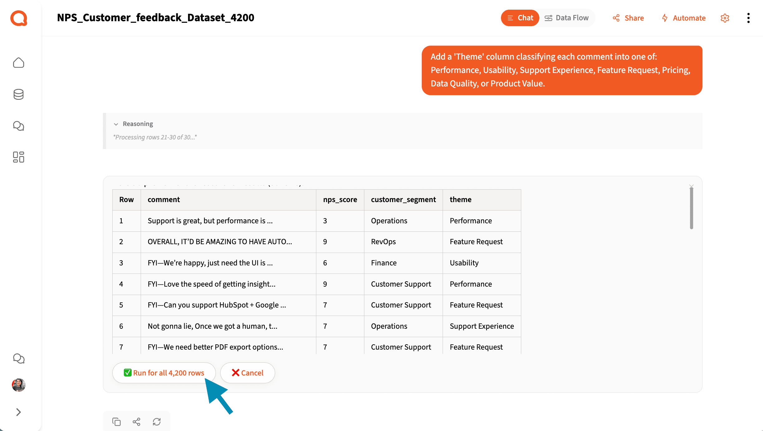
Tag every comment by theme
Add a 'Theme' column classifying each comment into one of: Performance, Usability, Support Experience, Feature Request, Pricing, Data Quality, or Product Value.
Once every row has a theme label, you can answer questions like "How many responses mention pricing?" or "What's the average NPS score for customers who mentioned support?" Your text data is now filterable and chartable.
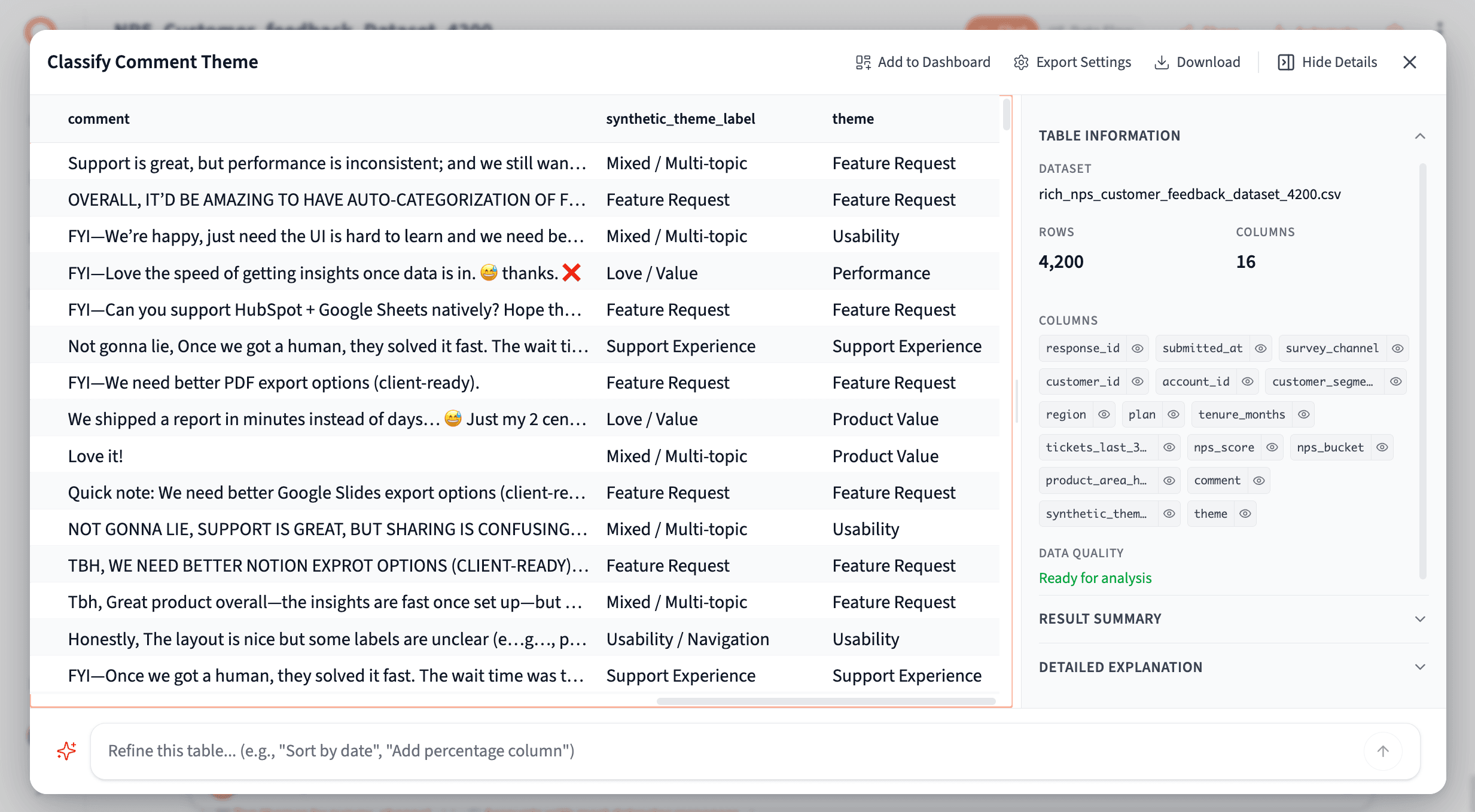
Result of: "Add a 'Theme' column classifying each comment into one of: Performance, Usability, Support Experience, Feature Request, Pricing, Data Quality, or Product Value."
Classify by sentiment
Add a 'Sentiment' column classifying each comment as Positive Feedback, Negative Feedback, Feature Request, or Mixed Sentiment.
A clean sentiment column that works well for dashboards and executive reporting. Chart the distribution, filter to negatives, and track how the mix shifts quarter over quarter.
Mirror how your support team tags tickets
Add a 'Complaint Category' column using one of: Slow Performance, Confusing Interface, Missing Features, Support Response Time, Data Issues, or Other.
If your support team already uses tags or ticket categories, this lets you align NPS feedback to the same buckets — so you can compare survey data against ticket volume and spot where they overlap.
Use Categorize to Discover Themes You Didn't Know Existed
The Categorize tool is for when you don't know the categories yet. Instead of applying labels you define, it finds the natural groupings in your data — then assigns every row to one. Use it when you're exploring unfamiliar data or running this analysis for the first time.
Let the data tell you what's in it
What are the main themes in these NPS comments?
The simplest and most powerful starting point. Querri analyzes your responses, surfaces the natural clusters, and offers three levels of detail — broad themes for a quick overview, medium for a working analysis, or specific for a deep dive.
Discover why detractors are unhappy — without guessing
For comments from customers with NPS scores of 6 or below, categorize the primary reason for dissatisfaction.
Filter to detractors first, then let Categorize find the patterns. You're not deciding what the buckets are — you're finding out what they actually are. The result is a ranked breakdown of root causes you can bring to a product or leadership meeting.
The Most Powerful Workflow: Combine Both Tools
The Researcher and Categorize tools work best together. Discover first, then structure — or ask questions first, then systematize the answers.
Let the AI design the categories for you
Analyze the comments and generate a set of categories that represent the main types of feedback customers are giving. Then assign each comment to the most appropriate category.
You don't have to guess what the categories should be. This prompt lets the AI find them in the data, then applies them back to every row. It's the full discovery-to-structure workflow in a single prompt.
Discover themes, then categorize at scale
First identify the most common themes in the NPS comments. Then create a category for each theme and classify every comment accordingly.
Same idea, phrased differently. Great for when you want to see the themes described before committing to a classification scheme.
Turn NPS feedback into an executive report
Analyze the NPS comments and categorize them into themes. Then summarize the top themes, how frequently they occur, and how they relate to NPS scores.
Start with raw feedback. End with a summary that connects themes to scores — the kind of output a leadership team can actually use to make decisions.
Turn Your Analysis Into a Presentation
Once you've analyzed your NPS data, you don't have to stop at a written summary or a filtered spreadsheet. You can ask Querri to turn your findings into a complete, shareable presentation.
Create a presentation of my NPS survey results.
Querri builds the slide deck for you — pulling in the themes, charts, and key findings from your analysis, organized into a logical narrative. You'll see it come together in real time as the slides generate in parallel.
The presentation includes interactive charts, inherits your organization's brand colors, and exports to PDF or PowerPoint — ready to drop into a quarterly review or share with stakeholders who weren't in the room.
Frequently Asked Questions
The Bottom Line
The score tells you where you are. The text tells you how to move.
Most NPS programs track one and ignore the other. These tools make it just as easy to work with the text as it is to calculate the number — without reading everything, without manual tagging, and without waiting days for an analyst to compile a report.
Connect your data, try a prompt, and see what's been hiding in your responses.
Start analyzing your NPS data →
Related reading:
Tags