How to Build a QBR Deck from Live Customer Data in Minutes
Stop spending a full day pulling data from five systems to build one QBR. Connect your CRM, usage, support, and billing data, then let Querri assemble a presentation-ready deck with live charts and talking points.
Open QuerriWhat you'll need
Querri (Free trial) to connect your data, run the analysis, and generate the QBR deck
CRM data — HubSpot or Salesforce connection with account records, deal stages, and renewal dates
Product usage data — CSV or database export with login frequency, feature adoption, or activity metrics by account
Support ticket history — CSV export from Zendesk, Intercom, or Freshdesk with ticket counts, categories, and resolution data
Optional: Billing data — CSV or database with contract value, renewal date, and expansion history
Need help?
If you have any questions, you can request a demo or email our team.
Before we begin
QBR prep is one of the most time-consuming rituals in customer success. Most CSMs spend 6 to 10 hours per account pulling data from CRM, support platforms, product analytics, and billing systems, then copying it into slides and manually building charts. By the time the meeting happens, it's already stale.
The problem isn't effort. It's architecture. Data lives in five or more systems with no single place to ask questions across all of them. This playbook shows you how to connect those sources to Querri, build a single account view in plain English, and generate a presentation-ready QBR deck complete with usage trends, health indicators, support history, and renewal context.
How it works:
- • Connect CRM, product usage, support, and billing data to Querri via native connectors or CSV upload
- • Ask Querri to join everything into a single account view: usage trends, open tickets, engagement history, and renewal dates, all in one prompt
- • Iterate in chat to add period-over-period comparisons, segment breakdowns, or benchmarks
- • Generate a Wrapped presentation: Querri builds a narrative slide deck with live Plotly charts, metrics cards, and talking-point summaries
- • Export as PDF or PowerPoint and share with your customer
Follow the steps
Connect your customer data sources
Start by connecting or uploading your CRM data, product usage metrics, support ticket history, and billing records into the Querri Library. Each source gets its own dataset; Querri profiles and prepares the data automatically.
If your systems support a direct data connection, check Querri's integrations page. Connected sources stay current without manual exports, so your QBR always reflects the latest data.
Minimum viable sources: CRM account data (with renewal dates) plus one additional source: usage, support, or billing. You can add more later. The more you connect, the richer the QBR.
Build a single account view
In the chat, join and filter your data into one account-level picture. This is the foundation of the QBR: all the metrics your customer cares about, pulled from across your systems.
"Show me usage trends, open support tickets, last engagement date, and renewal date for [Account Name]. Include monthly active users for the last 6 months, total tickets opened and resolved, and current contract value."
Why one account at a time? Each QBR tells a specific customer's story. Starting with a single account view lets you iterate on the narrative before scaling to your full book of business.
Add comparisons and period-over-period trends
Raw numbers don't tell a story. Trends do. Layer in quarter-over-quarter comparisons and segment breakdowns to give your customer context for how their metrics are moving.
"Compare this quarter's usage to last quarter for [Account Name]. Show the percentage change in monthly active users, support ticket volume, and feature adoption. Highlight any metrics that changed by more than 20%."
Follow up with deeper cuts if something stands out, e.g., "Break down the usage decline by user role" or "Show me which features saw the biggest drop-off." This is where the QBR narrative comes from.
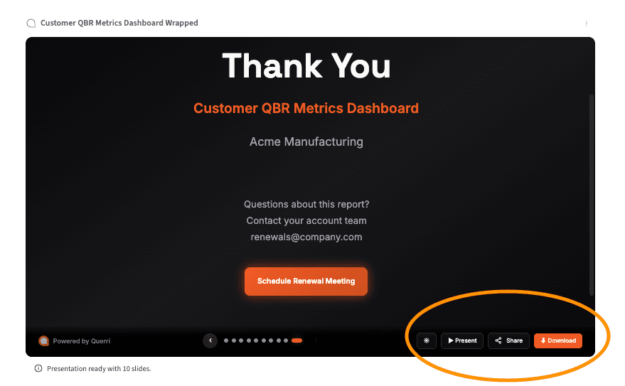
Generate a Wrapped presentation
This is where the analysis becomes the deliverable. Generate a Wrapped presentation from the chat — it pulls your charts, metrics, and insights into a structured, narrative slide deck.
"Generate a Wrapped presentation for [Account Name]'s quarterly business review. Include: an executive summary with key health metrics, a usage trend section with month-over-month charts, a support summary with ticket volume and resolution trends, and a renewal outlook slide with contract details and risk flags."
What you get: A branded slide deck with embedded Plotly charts, metrics cards, and auto-generated talking-point summaries for each section. The deck is structured around the narrative, not just the data.
Export and share with your customer
Export your finished QBR deck as a PDF for immediate sharing or as a PowerPoint file if you want to make final edits. Review the auto-generated talking points and adjust anything that needs a personal touch.
Many CSMs send the deck to the customer 24 hours before the meeting, so the conversation can focus on strategy rather than data review.
Sanity check: Before sharing, confirm your data sources have refreshed recently so the deck reflects current account state, not last quarter's sync. Spot-check 2-3 key metrics (ARR, MAU, ticket count) against your CRM to make sure the joins landed correctly.
Scale it across your book of business. Once you've built the QBR workflow for one account, rerun it for any other account by changing the account filter. The prompts, joins, and chart configurations carry over — so prepping 10 QBRs takes the same effort as prepping one.
Going deeper
Enrich your QBR with health scoring and risk analysis
Going deeper
Enrich your QBR with health scoring and risk analysis
The five steps above give you a strong QBR deck from structured data. When you want to add qualitative depth (support sentiment, ticket themes, or health scoring), the Researcher and Categorize tools open up three additional layers.
Classify support tickets by sentiment and urgency
Add a sentiment layer to your support data so the QBR shows not just how many tickets the account opened, but how frustrated they were. This turns a volume metric into a risk signal.
"Add a 'Sentiment' column to each support ticket, classifying it as Positive, Neutral, Frustrated, or Escalation-Risk based on the ticket text."
Compute a composite health score for the QBR
Build a weighted health score from multiple signals (usage, support, engagement, and billing risk) and include it on the executive summary slide to ground the conversation in data.
"Score [Account Name] 1-5 on login frequency, open ticket count, days since last engagement, and contract value at risk. Weight usage at 40%, support at 25%, engagement at 20%, and billing risk at 15%."
Surface the top support themes for the account
Instead of showing raw ticket counts, add a slide that breaks down what the customer has been contacting support about. This gives the QBR concrete discussion topics, not just numbers.
"What are the main themes in the support tickets for [Account Name] over the last quarter? Group by theme and show ticket count per theme."
Tips for a better QBR
Confirm data freshness before generating the deck
A QBR built on last month's data sync undermines credibility. Before generating the Wrapped presentation, verify that each data source has refreshed recently — especially CRM renewal dates and product usage metrics, which customers will notice immediately if stale.
Send the deck 24 hours before the meeting
Customers who've seen the data in advance come to the meeting ready to discuss strategy, not ask clarifying questions about charts. This shifts the QBR from a data-review session to a strategic conversation — which is what actually protects retention.
Build the workflow once, reuse for every account
The biggest time savings come from reuse. Once your QBR prompts and chart configurations work for one account, changing the account filter is all it takes to generate the next one. CSMs who build reusable workflows report dropping QBR prep from a full day to under 30 minutes per account.
Include one forward-looking insight
The best QBRs don't just look backward. Use the trend data to make a specific, data-backed recommendation — whether it's expanding a feature rollout, flagging a usage dip for discussion, or proposing a success plan adjustment. One concrete insight is more valuable than 10 slides of retrospective data.
Spot-check key metrics against your CRM
After generating the deck, verify 2-3 headline numbers (ARR, MAU, open tickets) against your source systems. Data joins occasionally produce mismatches — catching them before the customer does protects trust and saves you from awkward corrections mid-meeting.
Iterate on the narrative, not just the data
A QBR deck isn't a data dump — it's a story about the customer's quarter. After the initial generation, ask Querri follow-up questions to surface the "why" behind trends. The talking points Querri generates are a starting point; add your knowledge of the relationship, recent conversations, and strategic context.
Frequently asked questions
How long does QBR prep usually take without a tool like Querri?
What data sources do I need to build a QBR deck in Querri?
Can I reuse the same QBR workflow for different accounts?
What format does the QBR deck export in?
Do I need technical skills or SQL knowledge to use this workflow?
Other popular resources
Playbook
Analyze ticket volume drivers
Reduce repeat contacts with a data-driven deflection strategy.
Playbook
Track first response time
Compute FRT per ticket and rank agents by breach rate.
Demo
Request a walkthrough
See Querri in action with your own customer data.
Examples
Browse all use cases
Explore how other teams use Querri for data analysis.