Have you ever seen all your data in one place? See where all your data comes together.
Visualize maps your whole Library in one picture, from every connected system on the edge to the KPIs at the center, and lights up what the agent reads as it answers.
One map
For a lot of companies, it's the first time they've seen all their systems in one place.
Your data lives in a CRM, an accounting system, spreadsheets and a database someone set up. In most mid-sized companies, the map of how it all fits lives with one person. Visualize puts it on one map, from every system you connect to the KPIs the business runs on.
See the gaps
See what's connected, and what isn't yet.
Business questions and KPIs sit on the same map as the sources under them, so you can see which systems feed which collections, views and KPIs. You can also see the data that isn't connected into any of them yet, which tells you what to connect next.
Not connected into any collection yet
The brain scan
Watch the agent search, look things up and answer.
While the Librarian answers, each step's items light up on the map and the view moves to them, held long enough to follow. Expand an answer's route later and they light up again. You see which parts of your data it read, instead of taking the answer on trust.
- Searching the Library
- Looking up orders, billing and refunds
- Answering
In the app
The real map, lit up mid-answer.
These are screenshots of Querri with a demo company's data. The orange glow is the Librarian at work: the sources, collections and views it is reading right now.
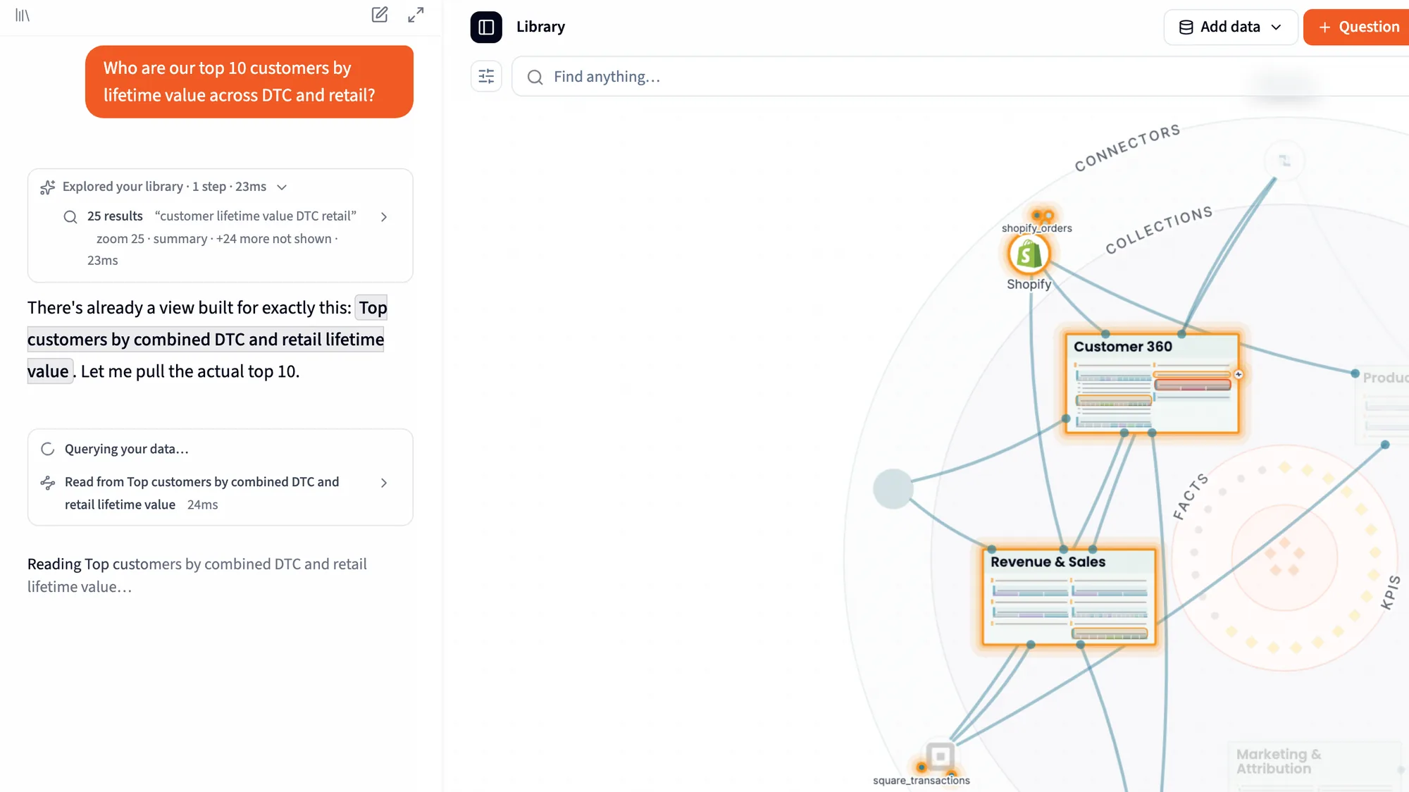
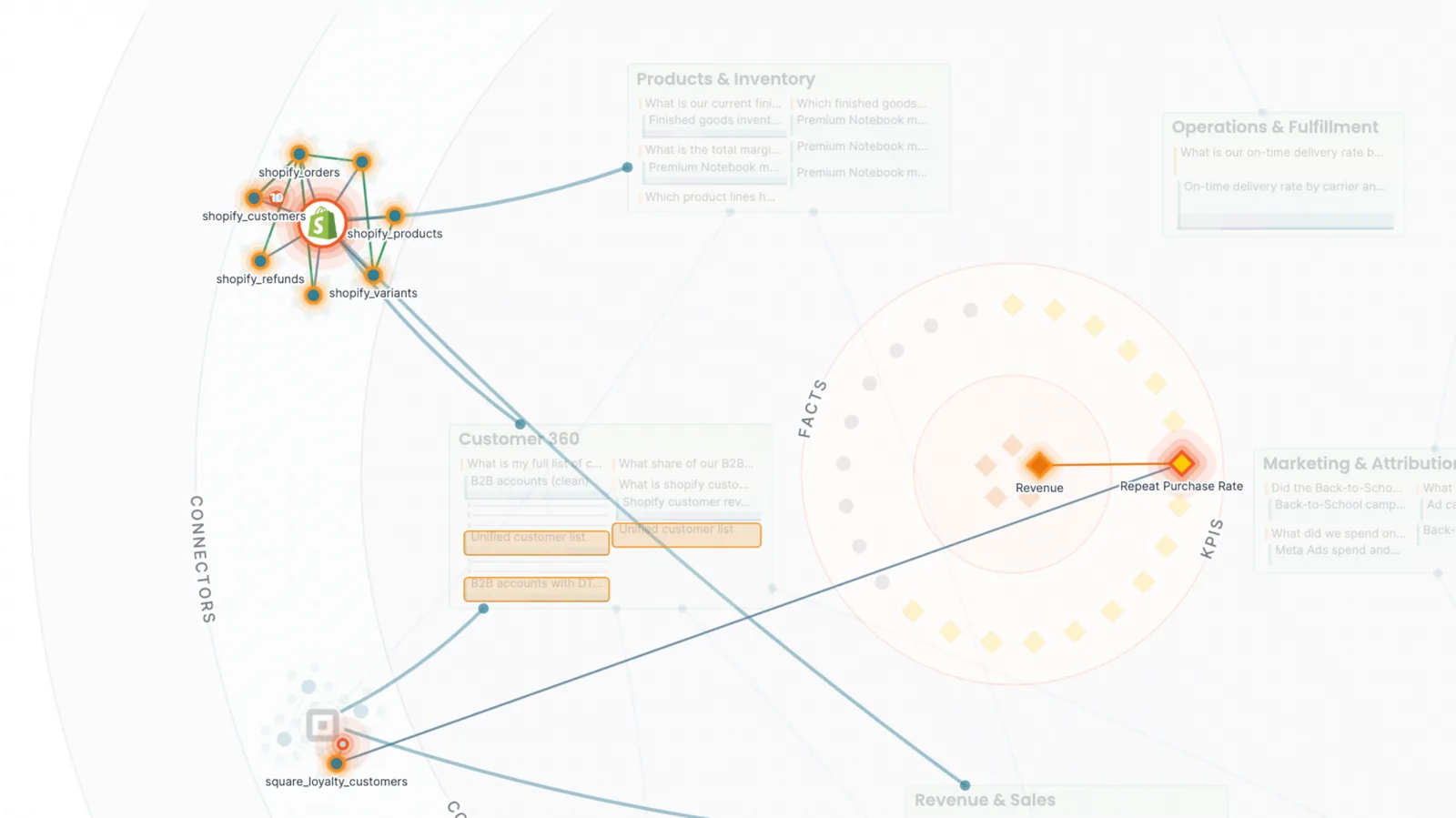
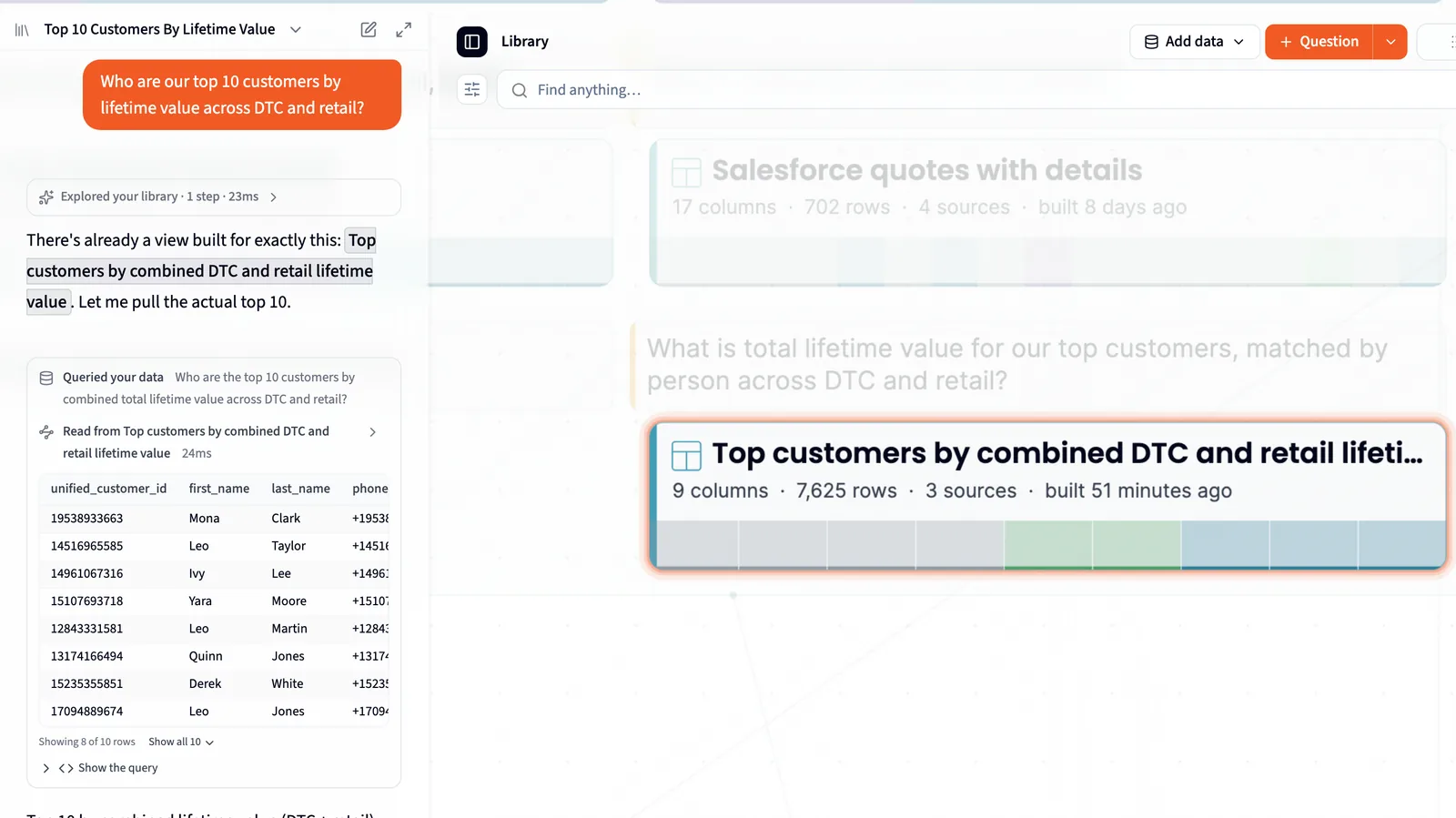
Zoom
Zoom from the whole business down to one column.
Four zoom levels, Overview, Browse, Detail and Close, each show more. Hover a column to see how its values are spread, what's missing and how many are unique.
orders
order_idcustomer_idregionstatusorder_totalregion
How values are spread
Point and ask
Point at part of your business, then ask about it.
Find anything… searches by meaning, and Zoom to lights up everything linked to a topic, using the same search every Querri agent uses to find data. Whatever is lit goes along as context on your next question to the Librarian.
- KPI Net revenue
- Collection Orders
- Table refunds
- Fact Refunds count in the month they're issued
Animated screens on this page are illustrations with example data. Screenshots are from Querri, using a demo company's data.
Updates as you work
The map grows as the Library does.
Changes appear without a reload
New collections, views, KPIs and facts from chat, the nightly work, the API and your teammates show up on the map while you have it open.
Everyone sees their own map
The map is filtered to what each viewer may see, and every change is checked against that viewer's access before it appears.
How it works
Three steps to the whole picture.
- 1
Switch List to Visualize
Open the Library and switch from List to Visualize to see everything you've connected in one picture.
- 2
Zoom out, then in
Start with every system around the edge, then zoom into one collection, one view, one column.
- 3
Ask, and watch
Ask the Librarian a question and watch the map light up as it searches, looks things up and answers.
Who it's for
One picture, read three ways.
Data consumer
See exactly which parts of the company's data the agent read to answer you.
Data owner
Your whole Library in one picture: every system you've connected, how it feeds the collections, views and KPIs, and the data that isn't connected into any of them yet.
Data team / IT
One picture from source system to KPI, with the keys that join the tables, filtered to what each viewer may see, and every view's SQL a click away.
FAQ
Questions about Visualize
What's on the map?
Connected systems and files ring the edge. Collections, with their questions and views, form the next ring. KPIs, the Five Dimensions and facts sit at the center, and green lines join tables that share a key.
Is this the same as the lineage view in our data catalog?
No. Keep your catalog's lineage for impact analysis. Visualize answers a different question: what the business knows, which questions and KPIs each source feeds, and what isn't connected yet, in a picture a data owner can read.
Does a good picture make the answer right?
No, and it isn't meant to; Querri checks its work separately. The map shows you which data the agent used, so you can see where an answer came from instead of taking it on trust.
Does everyone see the whole map?
No. The map is filtered to what each viewer may see, and every change that appears on it is checked against that viewer's access.
Can I ask about part of the map?
Yes. Find anything… searches by meaning, and Zoom to lights up everything linked to a topic. Whatever is lit goes along as context on your next question to the Librarian.
Where do I find it?
In the Library, on desktop. Switch the view from List to Visualize.
Keep exploring
What's on the map, and how it gets there
See all your systems in one picture.
Book a 30-minute demo. We'll zoom out to every system on the map, zoom into one column, then ask the Librarian a question and watch it light up.